Ripyl® is reimagining the way business studies are taught. This online platform empowers teachers with ready-to-use, real-world learning activities aligned to curriculum - bringing creativity back into the classroom while equipping students with the critical thinking skills needed for life beyond school.
This has been a dynamic, end-to-end project—spanning initial brand development, website design, and social media campaigns, through to the creation of educational content and the design of the platform’s user experience and interface.
The Brand
At its core is the idea of the ripple effect - a single action with the power to create meaningful change. The name ‘Ripyl’ reflects this perfectly. With a strong focus on today’s youth and nurturing a generation of design thinkers, the visual identity centres around young faces captured in expressive, thoughtful, and creative moments.
The Outcome
A bold, engaging platform of ready-to-teach resources, designed to build a connected community and shape confident, capable problem solvers.
Social Media | Print | Website
We’ve had fun designing this fresh spring campaign for Property Brokers — a playful “houses on holiday” theme featuring little homes relaxing under beach umbrellas. The campaign celebrates the launch of their $35,000 cash giveaway, available when you book a free property appraisal.
Sitting underneath the well-known Property Brokers brand, the creative is all about bringing a lighthearted, seasonal holiday vibe to real estate while highlighting a fantastic opportunity for homeowners.
Multiple assets were rolled out for this one, which ranging from social assets and videos, to agent branded print ads, flyers and billboard signage.
Branding | Website | Marketing
“Representing a new era of HR, bringing fresh thinking and a modern approach. It’s what sets us apart!”
That is what HR Mentor stands for, and was our brief for the tone of feel for their new logo and marketing…. create a brand that looks a little bit different, fun, and all about people. “Reach your potential’ was created as the company strap line, and provided the basis for a fun and quirky design - We are pretty stoked with the end result!
Logo | Brand | Marketing | Website | Signage
ONLA Accounting believe in putting people first – ”we may be accountants, but you’ll never be just another number to us." Accounting services are at the core of what they do, but that’s not all that they can do for you, working with new business start-ups to day-to-day accounting services, growth and development advice for established businesses to long term financial planning.
This brand represents all the facets that make up ONLA, in a colourful creative style to suit company values and culture. Growing business, managing accounts, and transforming businesses using a smarter approach and techniques are key messages that make up the ONLA brand overall.
Strong brand imagery and strap lines are what sets this visual design system apart from their competition, and connects with clients at a practical friendly level. The imagery and colour translate in to marketing and signage with ease, maintaining a visual system that is bold and unique.
There is nothing conservative about ONLA Accounting... or this brand!
Logo | Branding | Marketing | Signage
Bee Healthy Regional Dental Service is the community-based dental service providing support, education, and free (publically-funded) dental care for children in the Greater Wellington Region.
When the team came to us to brand the service, the brief was to connect with children, predominantly aged 5-12, in a fun and friendly way and build a platform by which to educate kids about about oral health and make the business of teeth fun…. so we created BarnaBee! A friendly, lovable little bee and icon for the Bee Healthy Regional Dental Service, perfectly suited to promote the Dental Service’s key messages of prevention, examination & treatment.
Combined with supporting imagery, the Bee Healthy brand was built and applied throughout a number of communications, resource material, multiple clinics and vehicle signage right across the region.
Design | Marketing | Print | Social
This vibrant campaign was designed to promote Property Brokers’ $30,000 grocery giveaway, with two tailored creative variations: one targeting sales leads, and the other focused on generating leads for property management.
The concept centred on the idea of abundance and everyday value, illustrated through bold, colourful grocery imagery bursting out of a shopping basket. The playful illustration style, paired with clean, high-impact typography, created instant cut-through and made the prize offering impossible to miss.
Both versions of the campaign were optimised for social media, digital, and print applications, ensuring consistency across platforms while allowing for targeted messaging. The designs delivered strong visual impact, reinforced brand recognition, and effectively engaged audiences across key markets.
Branding | Social | Marketing
This campaign was designed to promote Scallywaggs, a long-established early childhood education provider dedicated to creating a nurturing, inclusive environment where every child feels valued and respected. We developed a series of vibrant visuals that highlight the warmth and energy of the centres, using bold colour palettes and playful typography to reflect the brand’s fun, family-focused ethos.
The four creative executions - Where Every Child Belongs, Flexible Childcare for Growing Families, Empowering Young Minds, and Nature’s Playground - each focus on a different strength of the Scallywaggs experience: belonging and care, flexibility for families, and the rich opportunities for indoor & outdoor exploration. These designs were rolled out across digital and social channels, delivering a cohesive, eye-catching campaign that communicates Scallywaggs’ commitment to quality early learning and strong community connections.
Strategy | Brand | Website | Social
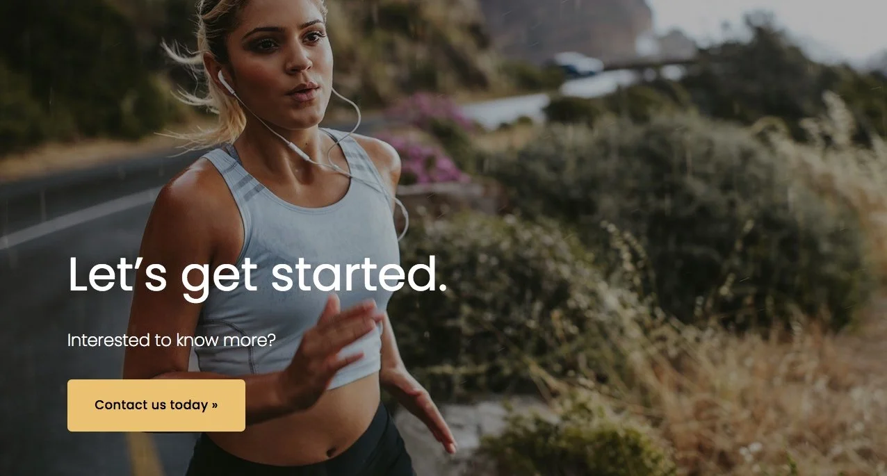
“Understanding your body, builds your best body”. The ERB team are a group of qualified sports therapists that will focus your efforts and navigate you towards meaningful change for your body.
When the team approached us to focus our efforts on their overall marketing strategy and online presence, we jumped at the chance to help! The objective was to strengthen ERB’s voice for story telling and promoting key services, appealing to the ‘want’ and ‘wish’ goals for both existing and targeted clients. We refined the look, style and tone for the ERB brand, and worked to streamline the customer experience and create a more integrated sales and marketing process from social right through to sign up.
We love working with enthusiastic people who believe in what they do, who get excited about positive change just as much as we do… and who share our vision of enhancing people’s lives.
www.eventreadybodies.co.nz
Marketing | Social Media | Advertising
This campaign creative was developed to celebrate Property Brokers’ recognition as a back-to-back winner of Canstar’s “Most Satisfied Customers – Real Estate Agents (Buyers & Sellers)” award in 2024 and 2025.
As Canstar is New Zealand’s leading financial comparison and consumer ratings organisation, the design needed to convey credibility, trust, and prestige while keeping the message clear and customer-focused.
The creative was a bold, striking visual featuring the Canstar award icons on podiums, paired with a clean, confident message: “One trusted name. Two Canstar wins.” The use of deep blue gradients and strong typography amplified the sense of authority and recognition, while maintaining alignment with Property Brokers’ brand identity.
This piece was rolled out across print and digital channels, reinforcing Property Brokers’ position as a market leader and celebrating the trust their customers place in them.
Branding, Website, Promotion
“We see a world where everyone has the opportunity to be an explorer, a problem solver, an everyday superhero, doing what they love.”
The Brave Venture are on a mission to build better people, and better business. They came to us with a brief to create a simple, effective brand, that could then translate in to strong marketing themes to promote their programmes with personality to inspire action and engagement.
We designed an entire branding system that included various sub-brands, with an over-arching themes of empowering individuals to embrace their passions and unlock explorer attributes laced throughout. You can take a look for yourself here: www.tbv.org.nz
Company Overview | Branding
Our clients’ technology uses a ground-breaking culmination of photobiology, engineering and data science. Their team of plant scientists, agronomists, engineers and data scientists based in the United States and New Zealand, work every day to maximise the power of UV.
Growth and investment are part of making their recipe of success, and when BioLumic came to us to help put what they do, and need, into a visual representation, we were eager to help. Designing a company profile and pitch for investment to be both engaging and easy to read, whilst promoting the very technology worth investing in was a challenge… one we enjoyed taking up.
And…. this design launched the refresh of the BioLumic brand! As a team we decided to update the company logo with the icon we designed for these reports, to better represent the process of UV light and its impact on growth. #brandevolution
Website Design
FoodHQ is an operating collaboration and network of eight of New Zealand’s foremost food science organisations working together to play a key role in the global food community.
FoodHQ is well-connected and respected and provide one–door access to the very best of New Zealand’s food science and innovation, and facilitates a single gateway for clients to access the research and commercialisation expertise of the collaboration partners.
We are very proud of our redesign of FoodHQ’s website, creating a site for our customer that encourages stakeholder engagement, and portrays an organisation that is doing something world-leading. www.foodhq.com
Branding | Web design | Website | Print
Your trust is the greatest gift we could ask for! To celebrate Client Appreciation Week, Property Brokers were giving away $13,000+ in vouchers as a heartfelt thank you. Clients were automatically entered in to the draw, the campaign needed to grab attention and stand out online.
We designed the creative to be simple and powerful, building the campaign around the theme “Thanks for vouching for us!”. Using the bold Property Brokers red, the design stood out across social channels and delivered a strong, heartfelt message of appreciation. This designed flowed through to many different applications, including email signatures, chocolate sleeves, and customised winner announcements.
This brand is all about connecting people, business and facilitating collaboration… vibrant and inviting to encourage a sense of activity and energy which is a perfect combo to reflect this space!
The design starts with the statement exterior signage and decals, and flows right through the building to the interior spaces, connecting people and location. Supported by the marketing and online presence, two36 is an experience.
We get to work out of this space as well… bonus! Come visit us and check it out! two36.com
Brand Design
Anél is an International Award Winning Milliner. She has an incredible talent for designing and making beautiful hats. Her woman’s fashion shop “MOOINOOI’ in George Street, Palmerston North is an elegant showcase of Anél’s hats, imported fashion, jewellery, and accessories. Its all about woman feeling fabulous and that’s where her brand tells the story.
We helped Anél put a face to her fashion with flair boutique, bringing her brand to life with a elegant simplistic logo, business card and signage for her beautiful shop.
Logo | Branding | Copy | Web design
Smooth Synergies is a consulting company that works with the many and varied facets of business to assist individuals and teams be more effective with the integration of people, process and place.
This brand was a creative exercise that required the merging of graphic, image and movement. The design needed to be corporate and polished, whilst capturing the concepts of progression and integration - and we like how it turned out!
The concept of 3 strands working collectively, evolving and integrating, is the inspiration that underpins the brand. Introduce some fresh, vibrant colours and imagery that promotes people working together, and you have what we now know as Smooth Synergies.
Branding | Marketing | Web Design
Innovate…. yes it’s been over 10 years and we are proud sponsors of this regional competition for yet another year. “Creativity is Contagious”. Celebrating 10 years was a good reason to create a new look for this flagship programme.
Innovate encourages local entrepreneurialism which sparks the local ecosystem growing young companies, new business and thought leaders as well as new technology. Just like a spinning-top, the Innovate logo signifies precision, balance, agility and speed.
When building capacity and capability in a start-up and founder, Innovate uses lean methodology to clearly articulate the start-up’s value proposition through to product validation and build. Each of these tools are showcased in the circle; nine steps to gain momentum, learn at pace and measure results. The faster Innovate can help the start-up turn the fly-wheel, or spin the top, the more success the start-up and founder has at achieving scale.
Check out the logo and refreshed site here > www.innovate.kiwi
Promotion | Layout | Digital
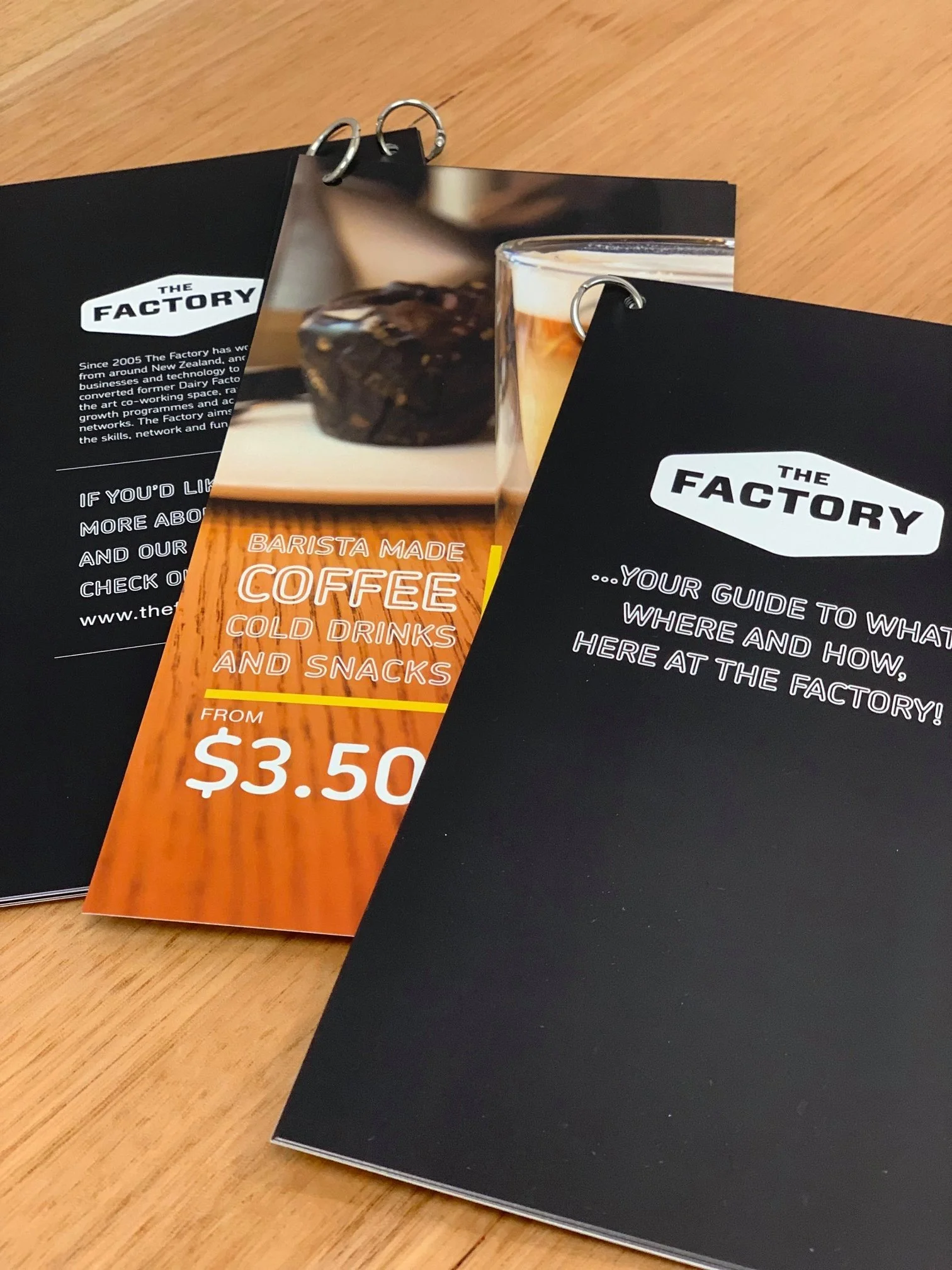
This project involved creating a series of flyers to promote The Factory Café’s rotating specials and signature drinks. The design direction drew from the café’s industrial-inspired brand identity - a nod to its location within The Factory’s creative precinct - using the existing logo elements, colour palette, and typography to maintain visual cohesion across all touch points.
The challenge was to keep the promotional materials feeling fresh and contemporary while staying true to The Factory’s authentic, down-to-earth character. We paired clean, structured layouts with bold imagery and subtle textural details to echo the café’s raw, modern aesthetic. Each flyer was designed to feel approachable and vibrant, showcasing the drinks in a way that invites customers to stop, look, and taste.
Logo | Branding | Website
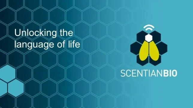
Scentian Bio was formed to create a novel technology for commercial use in medical, food and industrial settings. “We are harnessing the powerful smell receptors from insects to deliver a sensor technology that will put nature's language at your fingertips.”
An exciting journey for Scentian Bio as they build their business, and we have the privilege of building their brand. Capturing the core essence of their business and its original combination of science, and bio-technology, whilst showcasing their very point of difference - using odourant receptors from nature’s own.
The logo, brand and website are a visual feast that sells the unique nature of Scentian Bio’s technology. We are excited about the potential of this brand and the very company it represents.
Website
YOLO is the World’s first mobile app designed specifically to promote the safety & well-being of international students, offering a connected student experience.
Leaving home and studying in a foreign country can be an exciting, and sometimes daunting experience. When YOLO first approached us to create a website to promote and create an online presence for their app, it became quite clear from the onset that this was much bigger than a website. Assisting students to interact within a connected experience, and promoting pastoral care for international students is what this site represents. www.yolo-app.co.nz
Logo | Branding | Packaging
Envie is all about skin care, makeup and promoting inner healthy and beauty. Founder Melissa Campbell is an experienced make up artist with a wealth of knowledge around transforming the inner you to reflect your beauty on the outside.
When Melissa came to us with the brief to give her own company a facelift, we were excited…. grace and sophistication, with a hint of rosemary to promote health and inner cleansing was our creative challenge, and we love the end result.
Branding
Creating the name and look for this up-and-coming success story was a lot of fun. Neil Rivers, innovate 2019 finalist developed an innovative system for monitoring home air quality, now known as 'roomy'.
Watch this space as roomy develops in both a residential and commercial capacity, to work as your sensible room-mate, bringing with it the assurance of clean air, regulated temperature, and peace of mind to many parents.